For indie games
App Store screenshots for indie games
Indie game screenshots are a different game (sorry) from utility apps. Players are scrolling fast and scanning for energy, character, and a hook — not a feature list. The hero shot needs to communicate the genre and the vibe in 200ms. Saturated solids, oversized type, and a hint of motion read better than any in-game render at thumbnail size, especially for casual and puzzle titles where the actual gameplay is hard to summarize visually.
What converts
What works for indie games
Genre + vibe legible at thumbnail size — a player should know it's a puzzle, runner, or RPG without reading anything.
Oversized headline copy with one verb-driven hook ("Smash to survive", "Match. Chain. Win.")
Character-forward art on the hero — a face or a creature beats abstract gameplay almost always.
In-game UI screenshots with HUDs, health bars, and currency icons — players ignore them on the listing.
Tutorial language ("Tap to jump") — the listing isn't onboarding.
Muted indie palettes that lose to App Store carousel competitors with brighter art.
Headline patterns
Headlines that work on indie games
The hero headline does more conversion work than the artwork behind it. These three patterns are the ones that keep landing for indie games — an outcome with a number in it, a single daily moment, and a promise the buyer can picture. ShotStudio writes yours from your one-line pitch, then every line is click-to-edit on the preview.
- Shot 01
“Smash to survive”
- Shot 02
“Match. Chain. Win.”
- Shot 03
“One tap. 30 seconds. Chaos.”
Same rule everywhere in the carousel: shot 1 sells the outcome, shot 2 shows the workflow, shot 3 shows the differentiator.
Preset · Bold
The bold preset, applied
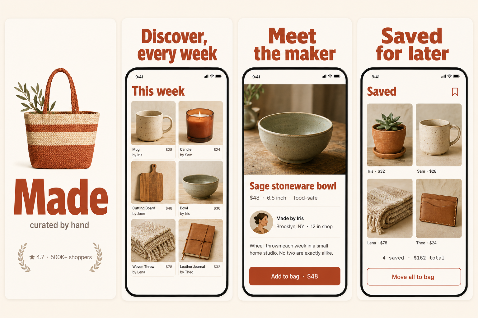
ShotStudio defaults indie games to the Bold personality preset. Voice: punchy, direct, single verb hooks. Typography: oversized display sans, sticker-energy, headlines first. Theme and palette are sampled from your uploads, so the marketing matches your actual app — override the personality on the wizard step if you want a different one.
Workflow
Three uploads in. Three polished shots back.
Drop three raw simulator screenshots, name your app, write a one-line pitch. ShotStudio writes the headline, picks the preset, and returns three 1290×2796 shots ready for App Store Connect — in under a minute.
Upload three screenshots
Hero feature, differentiator, one more. PNG or JPEG, up to 10 MB. Never written to disk.
Name your indie games app
App name, one-sentence pitch. Example: "Tap-to-survive arcade game where every level is a 30-second adrenaline shot." — we write the headline and pick the preset.
Download three polished shots
1290×2796 sRGB PNGs, no watermark. Click-to-edit any text on the preview before exporting.
FAQ
Indie games screenshot questions
Should indie game screenshots include actual gameplay or stylized art?
Both. Hero shot can be stylized — your most iconic character or moment, oversized and saturated. Shots 2 and 3 should show actual gameplay so reviewers and players see what they're getting. Apple has rejected listings where every shot is concept art.
Do screenshots need to match the in-game art style exactly?
Closely, yes. Apple guidelines require screenshots to represent the actual app experience. You can stylize for impact (oversized text, bolder colors) but the core characters and visual style must match.
Why Bold for games?
Because games need oversized headlines and punchy verbs to cut through the carousel — Bold gives you that with display type and direct copy voice. Color saturation comes from your actual game screenshots; if your art is muted, the marketing inherits it. Bold brings the typography heat on top.
Tools compared
What indie games usually get built in
Most indies shipping indie games reach for a template editor or a monthly subscription first. Both work — here's the honest read on when they're the better call and when a $7 one-time set is.
Read next
Before you upload anything
Get the spec right first — a indie games listing gets rejected for the same three reasons as everyone else's.
Related categories
More on creative, media & game apps
Art-forward categories where the hero shot has to land the vibe at thumbnail size.
Nothing close enough? Browse App Store screenshots by app category — all 40 of them, grouped by what the carousel has to prove.