For ebook reader apps
App Store screenshots for ebook reader apps
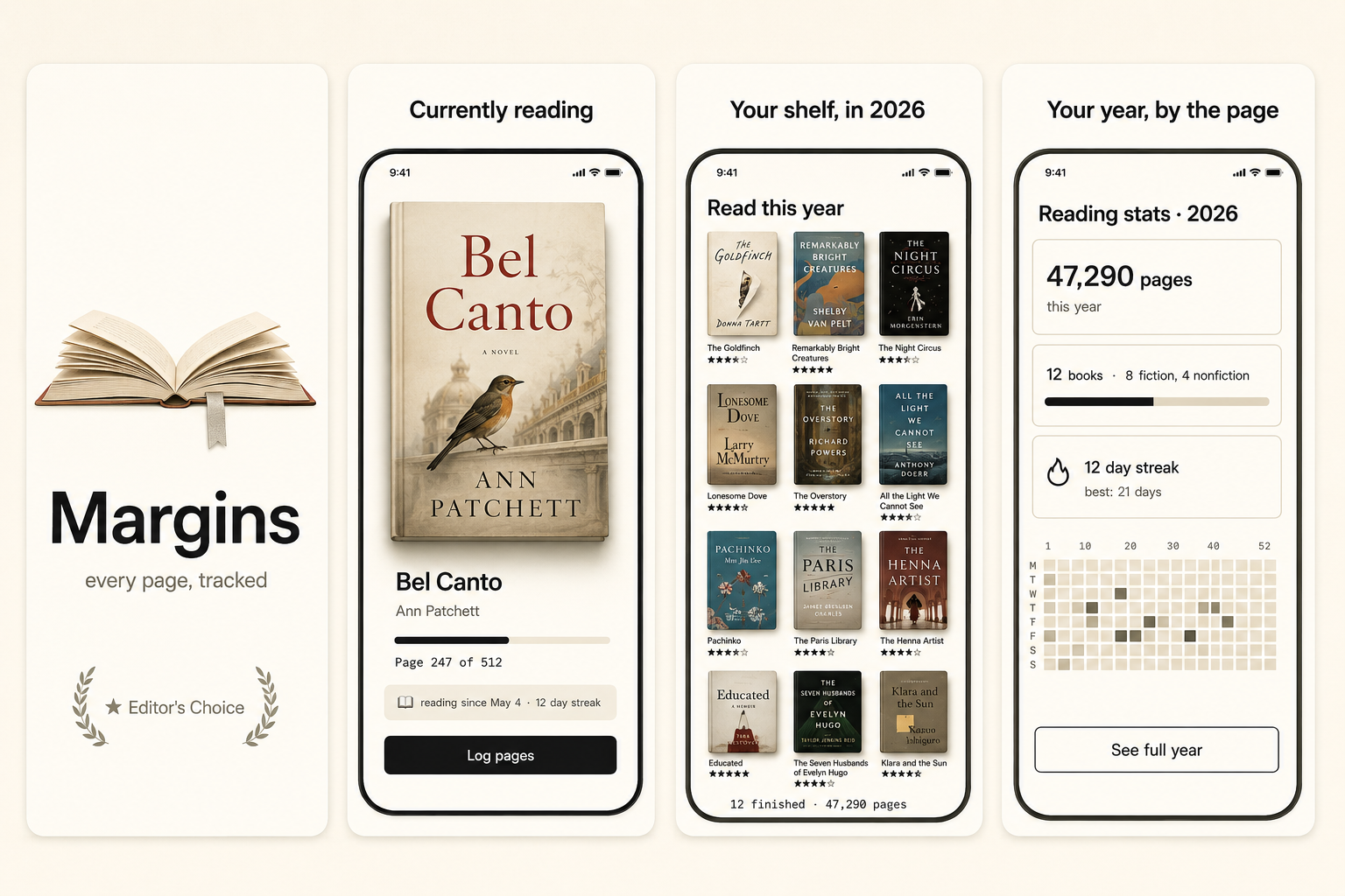
Ebook-reader screenshots sell the pleasure of reading. The hero is a beautiful reading page — typography, comfortable margins, a warm or paper-like background — that makes the buyer want to curl up with it. The differentiators (library, sync, highlights, fonts) matter but go on secondary shots. The failure mode is a cluttered library grid that looks like a store, when the buyer is shopping for a better place to read.
What converts
What works for ebook reader apps
A beautiful reading page — gorgeous typography, comfortable margins, a paper-like background.
One reading-experience differentiator — adjustable fonts, a warm night theme, distraction-free mode.
Headline copy naming the pleasure ("Reading that feels like paper"), not feature counts.
Cluttered library grids as the hero — reads as a bookstore, not a reading sanctuary.
Cramped, badly-spaced text that looks uncomfortable to actually read.
Generic stacked-books or open-book stock imagery instead of your actual reading view.
Preset · Minimal
The minimal preset, applied
ShotStudio defaults ebook reader apps to the Minimal personality preset. Voice: considered, short sentences, calm. Typography: restrained sans, plenty of whitespace, type does the work. Theme and palette are sampled from your uploads, so the marketing matches your actual app — override the personality on the wizard step if you want a different one.
Workflow
Three uploads in. Three polished shots back.
Drop three raw simulator screenshots, name your app, write a one-line pitch. ShotStudio writes the headline, picks the preset, and returns three 1290×2796 shots ready for App Store Connect — in under a minute.
Upload three screenshots
Hero feature, differentiator, one more. PNG or JPEG, up to 10 MB. Never written to disk.
Name your ebook reader app
App name, one-sentence pitch. Example: "An ebook reader with typography so good you forget you're reading on a phone." — we write the headline and pick the preset.
Download three polished shots
1290×2796 sRGB PNGs, no watermark. Click-to-edit any text on the preview before exporting.
FAQ
Ebook reader apps screenshot questions
Should ebook-reader screenshots show the library or the reading page?
Lead with the reading page — beautiful typography and comfortable layout are the experience the buyer is shopping for. The library is a secondary shot. Sell the pleasure of reading before the size of the catalog.
How do I handle book covers and rights in screenshots?
Use public-domain titles, your own example content, or covers you have permission to show. Featuring real copyrighted book covers prominently without clearance risks rejection — public-domain classics are a safe, credible choice.
Why Minimal for ebook reader apps?
Because reading is about calm and typography, and Minimal makes the page itself the hero with restraint and whitespace. Theme is sampled from your uploads, so a warm sepia reader keeps its warmth.