For education apps
App Store screenshots for education apps
Education-app screenshots have to make learning look achievable, not overwhelming. The buyer (often a learner mid-doubt, or a parent) needs to see one clear lesson and a sense of progress, rendered calmly enough that the app reads as the opposite of a textbook. The instinct to show a full curriculum tree is the killer — it reads as homework, and homework is exactly what the buyer is trying to escape.
What converts
What works for education apps
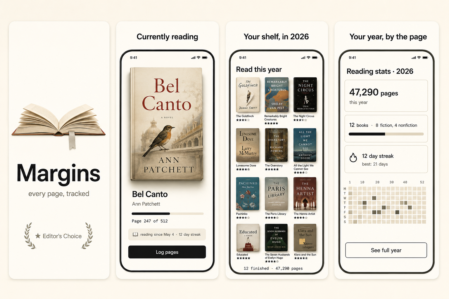
One clear lesson or concept in detail — the smallest satisfying unit of learning.
A visible progress signal — a completed module, a skill bar, a streak — that proves momentum.
Headline copy promising the outcome ("Understand statistics in a week"), not the syllabus.
Full curriculum trees showing 40 lessons — read as a workload, not a win.
Stock photos of graduation caps, chalkboards, or apples — category-wide clichés.
Dense text-heavy lesson screens — the buyer fears exactly this kind of overload.
Preset · Minimal
The minimal preset, applied
ShotStudio defaults education apps to the Minimal personality preset. Voice: considered, short sentences, calm. Typography: restrained sans, plenty of whitespace, type does the work. Theme and palette are sampled from your uploads, so the marketing matches your actual app — override the personality on the wizard step if you want a different one.
Workflow
Three uploads in. Three polished shots back.
Drop three raw simulator screenshots, name your app, write a one-line pitch. ShotStudio writes the headline, picks the preset, and returns three 1290×2796 shots ready for App Store Connect — in under a minute.
Upload three screenshots
Hero feature, differentiator, one more. PNG or JPEG, up to 10 MB. Never written to disk.
Name your education app
App name, one-sentence pitch. Example: "A learning app that teaches one hard idea per day in a five-minute lesson." — we write the headline and pick the preset.
Download three polished shots
1290×2796 sRGB PNGs, no watermark. Click-to-edit any text on the preview before exporting.
FAQ
Education apps screenshot questions
Should education-app screenshots show the lesson content or the dashboard?
Lead with one lesson, shown in satisfying detail. The dashboard is a secondary shot. Buyers want to feel what learning in your app is like, not see how progress is tracked first.
How do I make learning look easy, not overwhelming?
Show one concept, lots of whitespace, and a clear sense of completion. Avoid showing the full course outline — it triggers the exact overwhelm the buyer is trying to avoid.
Why Minimal for education apps?
Because the learning buyer's fear is overload, and whitespace is the visual antidote. Minimal uses restraint and typography to make the app feel calm and doable. Palette comes from your uploads.