For sleep apps
App Store screenshots for sleep apps
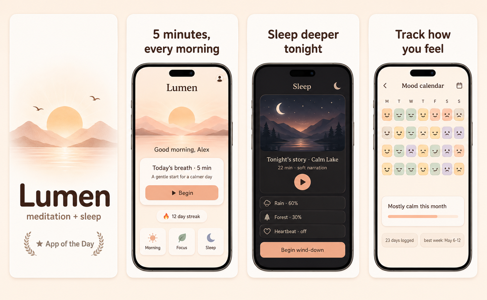
Sleep-app screenshots are seen at the exact moment the buyer wants to stop looking at screens. They have to feel like the end of the day — dark, soft, low-contrast — and promise rest, not engagement. The category overlaps with meditation but has its own visual grammar: a sleep timer, a soundscape, a gentle alarm. Anything bright or busy breaks the spell instantly.
What converts
What works for sleep apps
A dark, soft, low-contrast hero that literally looks like winding down for the night.
One sleep feature shown calmly — a soundscape, a wind-down timer, a gentle wake-up.
Headline copy that promises rest ("Fall asleep without your phone"), not screen time.
Bright white screens — physically wrong for the moment the buyer is in.
Busy dashboards of sleep stats — analytics belong on a secondary shot, if at all.
Stock photos of people sleeping in perfect beds — generic-wellness cliché.
Preset · Friendly
The friendly preset, applied
ShotStudio defaults sleep apps to the Friendly personality preset. Voice: warm, plainspoken, talks-to-a-peer. Typography: rounded sans-serif, generous letter-spacing, warm and humane. Theme and palette are sampled from your uploads, so the marketing matches your actual app — override the personality on the wizard step if you want a different one.
Workflow
Three uploads in. Three polished shots back.
Drop three raw simulator screenshots, name your app, write a one-line pitch. ShotStudio writes the headline, picks the preset, and returns three 1290×2796 shots ready for App Store Connect — in under a minute.
Upload three screenshots
Hero feature, differentiator, one more. PNG or JPEG, up to 10 MB. Never written to disk.
Name your sleep app
App name, one-sentence pitch. Example: "A sleep app that fades out a story and your screen together so you actually drift off." — we write the headline and pick the preset.
Download three polished shots
1290×2796 sRGB PNGs, no watermark. Click-to-edit any text on the preview before exporting.
FAQ
Sleep apps screenshot questions
Should sleep-app screenshots show sleep tracking data?
Only as a secondary shot, if at all. The hero should feel like the moment of falling asleep, not a morning report. Lead with the wind-down experience; the buyer is shopping at night, not analyzing data.
Why does dark mode matter so much for sleep apps?
Because the buyer is literally in a dark room at bedtime, and a bright screenshot feels physically wrong. Dark, low-contrast screenshots match the use moment and signal the app respects your eyes at night.
Why Friendly for sleep apps?
Because rest is gentle and human, and Friendly's rounded type plus calm voice match that. The soft dark palette comes from your uploads — most sleep apps ship those tones, so the marketing inherits them.