For ecommerce apps
App Store screenshots for ecommerce apps
Ecommerce-app screenshots are really product-merchandising screenshots: the buyer wants to see what shopping feels like, not a list of features. The hero shot should show one beautiful product in a clean layout, the way a good storefront does — generous whitespace, one price, one tappable buy moment. The instinct to cram a category grid into the hero is the fastest way to look like a marketplace nobody curated.
What converts
What works for ecommerce apps
One hero product shot in a clean layout — the storefront, not the settings screen.
A visible, frictionless buy moment — one button, one price, one tap away from checkout.
Whitespace that signals curation — the app feels chosen, not scraped.
Dense category grids in the hero — read as cluttered marketplace, not a brand.
Lorem-ipsum product names and $0.00 prices — every buyer spots the placeholder.
Five payment-method badges crammed in — trust signals belong at checkout, not the listing.
Headline patterns
Headlines that work on ecommerce apps
The hero headline does more conversion work than the artwork behind it. These three patterns are the ones that keep landing for ecommerce apps — an outcome with a number in it, a single daily moment, and a promise the buyer can picture. ShotStudio writes yours from your one-line pitch, then every line is click-to-edit on the preview.
- Shot 01
“Checkout in two taps”
- Shot 02
“Your cart, on every device”
- Shot 03
“Track every order in one place”
Same rule everywhere in the carousel: shot 1 sells the outcome, shot 2 shows the workflow, shot 3 shows the differentiator.
Preset · Minimal
The minimal preset, applied
ShotStudio defaults ecommerce apps to the Minimal personality preset. Voice: considered, short sentences, calm. Typography: restrained sans, plenty of whitespace, type does the work. Theme and palette are sampled from your uploads, so the marketing matches your actual app — override the personality on the wizard step if you want a different one.
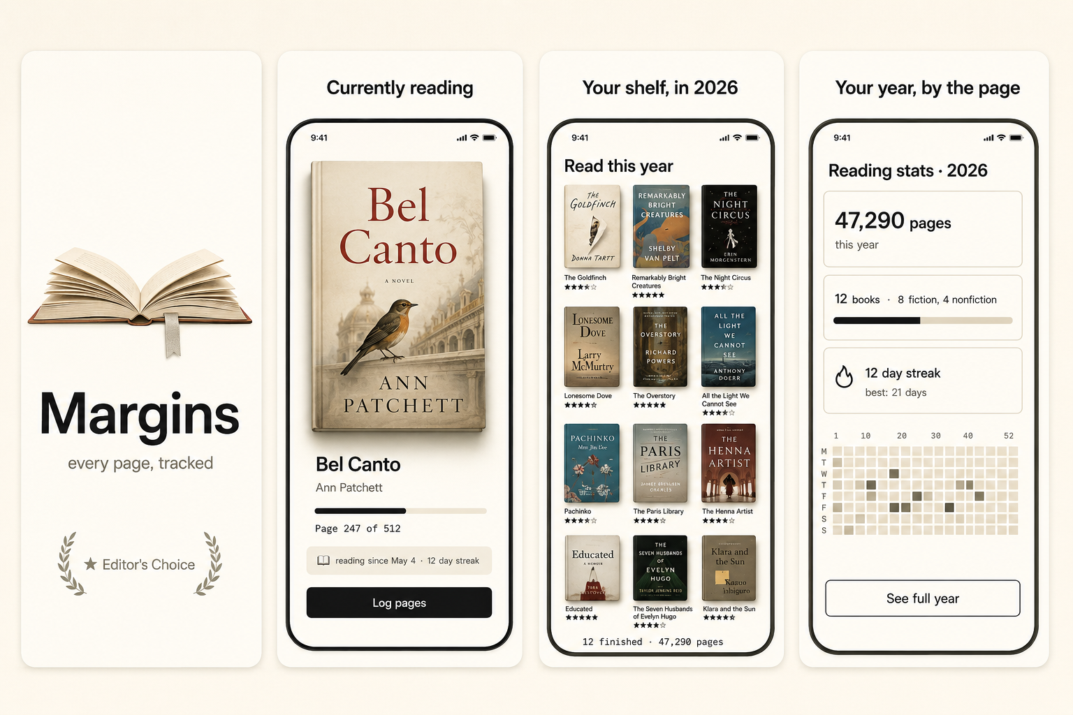
Workflow
Three uploads in. Three polished shots back.
Drop three raw simulator screenshots, name your app, write a one-line pitch. ShotStudio writes the headline, picks the preset, and returns three 1290×2796 shots ready for App Store Connect — in under a minute.
Upload three screenshots
Hero feature, differentiator, one more. PNG or JPEG, up to 10 MB. Never written to disk.
Name your ecommerce app
App name, one-sentence pitch. Example: "A one-tap shopping app for independent makers — checkout before you change your mind." — we write the headline and pick the preset.
Download three polished shots
1290×2796 sRGB PNGs, no watermark. Click-to-edit any text on the preview before exporting.
FAQ
Ecommerce apps screenshot questions
Should ecommerce screenshots show real products or mockups?
Real-looking products with plausible names and prices. If you have permission to show actual catalog items, even better — Apple wants screenshots to represent the real shopping experience, and real products read as trustworthy.
Is the checkout flow worth a screenshot?
On a secondary shot, yes. A clean one-tap checkout is a strong trust signal for a buyer worried about a clunky purchase — but lead with the product browsing experience on the hero.
Why Minimal for ecommerce apps?
Because the product should be the hero, not your UI chrome. Minimal uses whitespace and restrained type so the merchandise carries the shot. Theme and palette are sampled from your uploads, so a bright brand stays bright.
Tools compared
What ecommerce apps usually get built in
Most indies shipping ecommerce apps reach for a template editor or a monthly subscription first. Both work — here's the honest read on when they're the better call and when a $7 one-time set is.
Read next
Before you upload anything
Get the spec right first — a ecommerce app listing gets rejected for the same three reasons as everyone else's.
Related categories
More on money & finance apps
One number, large, with one piece of context. Everything else in the shot whispers.
Nothing close enough? Browse App Store screenshots by app category — all 40 of them, grouped by what the carousel has to prove.