For task management apps
App Store screenshots for task management apps
Task-management screenshots sit in the most ruthlessly competitive corner of productivity. To stand out you show one workflow done beautifully — a single project, a clean today-view, a satisfying completed task — and resist the urge to prove depth by cramming in boards, calendars, and dependencies. Buyers fleeing a bloated tool want to see calm and focus, not a feature arms race.
What converts
What works for task management apps
One clean today-view or project — a single workflow shown end to end.
A satisfying moment of completion — a checked task, an emptied inbox, a cleared day.
Headline copy that names the relief ("Know what to do next, always"), not the feature matrix.
Kanban + calendar + list + timeline crammed into one shot to prove power — reads as overwhelm.
Dense feature-comparison-style screens — the buyer left a complicated tool to escape exactly this.
Stock illustrations of busy office teams — signals enterprise SaaS, not a focused personal tool.
Preset · Minimal
The minimal preset, applied
ShotStudio defaults task management apps to the Minimal personality preset. Voice: considered, short sentences, calm. Typography: restrained sans, plenty of whitespace, type does the work. Theme and palette are sampled from your uploads, so the marketing matches your actual app — override the personality on the wizard step if you want a different one.
Workflow
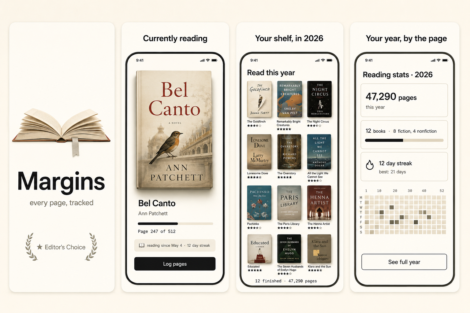
Three uploads in. Three polished shots back.
Drop three raw simulator screenshots, name your app, write a one-line pitch. ShotStudio writes the headline, picks the preset, and returns three 1290×2796 shots ready for App Store Connect — in under a minute.
Upload three screenshots
Hero feature, differentiator, one more. PNG or JPEG, up to 10 MB. Never written to disk.
Name your task management app
App name, one-sentence pitch. Example: "A task app that shows you only today, so you stop drowning in your own backlog." — we write the headline and pick the preset.
Download three polished shots
1290×2796 sRGB PNGs, no watermark. Click-to-edit any text on the preview before exporting.
FAQ
Task management apps screenshot questions
How do I differentiate a task app in a crowded category?
Show one opinionated workflow beautifully instead of proving breadth. Buyers are fleeing bloated tools — the differentiator that converts is a clear, calm view that makes "what do I do next" obvious.
Should I show multiple views (board, calendar, list) in screenshots?
Pick the one your app does best and lead with it. Showing every view at once signals the same overload the buyer is trying to escape. Depth can live on secondary shots, one view per shot.
Why Minimal for task management apps?
Because the buyer's pain is overload, and whitespace is the visual promise of calm. Minimal uses restraint over ornament. Palette is sampled from your uploaded screenshots.